BankUnited · Miami · 2018–2022 · Consultant (Capco) to AVP, UI/UX Manager
From visual refresh to a new digital banking experience.
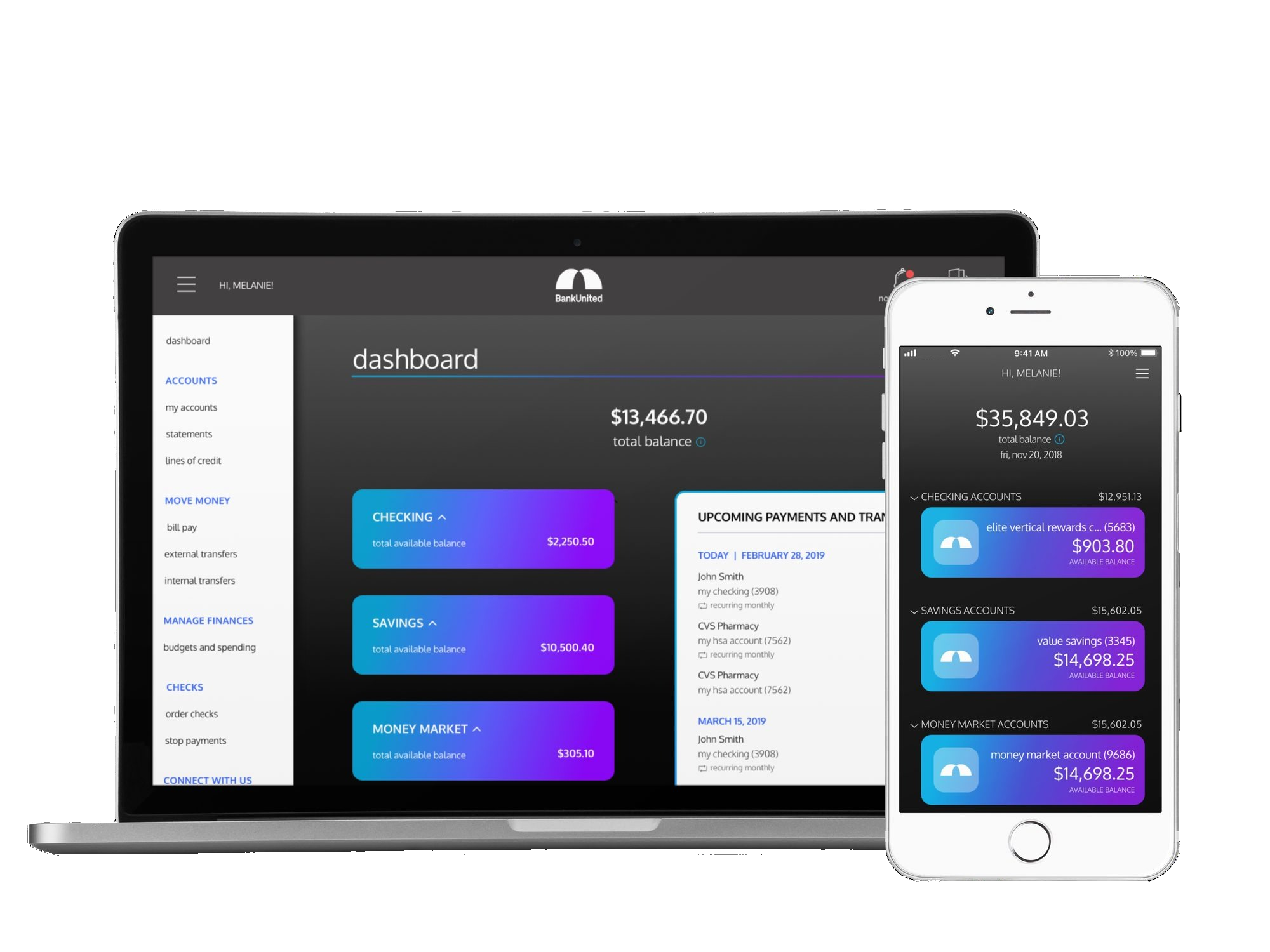
I led BankUnited’s consumer banking redesign from discovery through launch, creating a new brand identity and the bank’s first design practice along the way. The experience shipped across iOS, Android, and web to more than 30,000 customers.
Scope
Expanding a visual refresh into a full product rebuild
I joined BankUnited as a Capco consultant to lead what was initially planned as a visual refresh of its consumer banking app, one part of a wider organizational transformation. BankUnited’s online banking no longer matched the service or functionality its customers expected, and the engagement grew into a broader product and practice-building role. Ten months in, BankUnited hired me as its first UX/UI designer and manager, giving me continuity from early research through MVP launch and three years of iteration.
UX/UI Design Lead, UX Researcher, design thinking workshop facilitator, Product Owner, and Business Analyst.
Consumer banking across iOS, Android, and web, plus the bank’s first design system and a new visual identity.
Product, Engineering, QA, Legal and Compliance, Marketing, IT Security, executive leadership, and Capco’s Business Analysis and Project Management teams.
Backbase and Fiserv, with integrations including Okta, MX, Twilio, Google Maps, and USPS address verification.
The work had real limits. Backbase’s low-code platform constrained customization, Engineering was learning it while building, and the budget covered an app redesign rather than the broader identity work the product needed. Formal usability-testing services were also deprioritized.
Defining what we could build on Backbase
I partnered with Engineering and vendors to identify what we could customize, where native patterns would speed delivery, and where the product needed a deliberate workaround.
Making the case for a new identity
I showed leadership why putting a modern product behind a dated identity would weaken the transformation. They approved the rebrand, which extended across the organization and added roughly $70,000 in profit to Capco’s engagement.
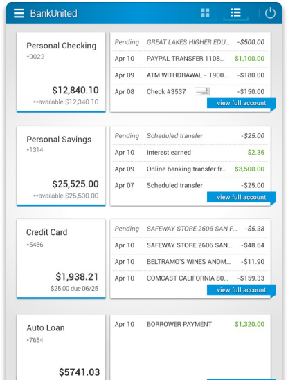
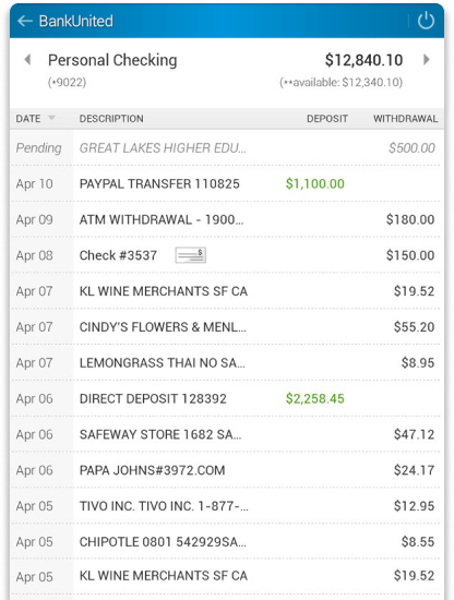

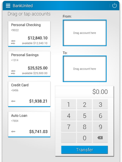
The original experience was dense, dated, and limited in the functionality customers expected.
Discovery
Turning 12 interviews into the product roadmap
I facilitated discovery with five walk-in branch customers and seven BankUnited employees who also banked there. We synthesized the interviews into two personas. Melanie, our primary persona, then anchored the current- and future-state journey maps. A competitive review helped us pressure-test the opportunities. We translated that direction into 13 initial capability areas, 23 epics, and more than 100 user stories.
Mapping the breakdowns and defining the direction
Melanie’s current journey connected problems that looked separate in the interface: moving money required another app, a fraud decline became multiple phone calls, and outdated contact information made recovery slower. The future-state journey explored how BankUnited could connect that experience through in-app money movement, transfer confirmation, and real-time fraud alerts. It gave the team a concrete direction, although not every part was included in the MVP.
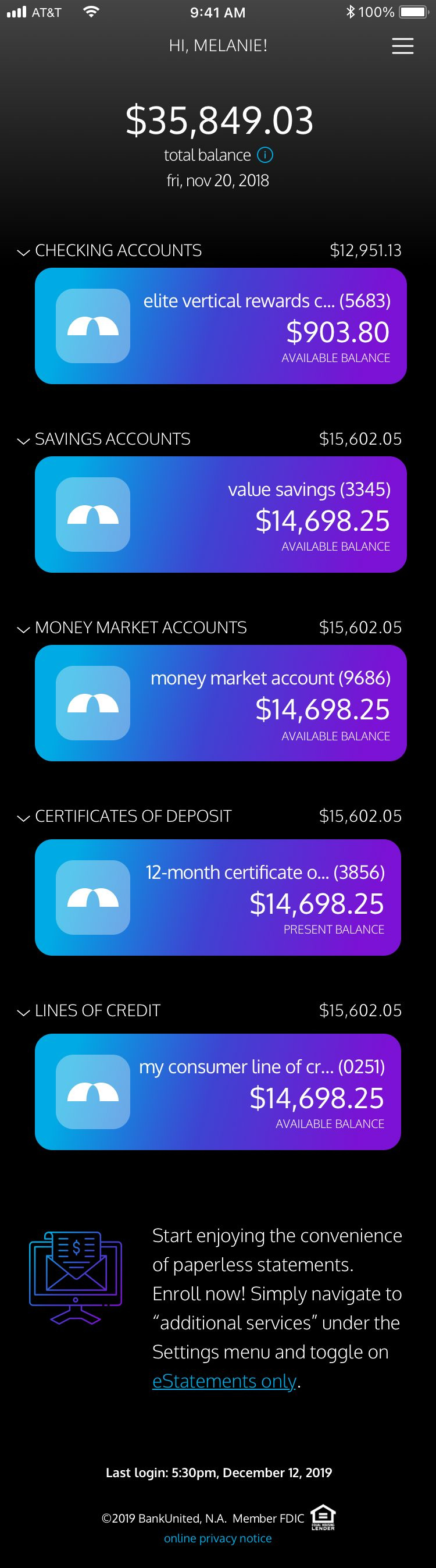
Because checking balances was the most common digital task, the redesigned home screen surfaces total balance and grouped accounts immediately.
Customers used other institutions and apps to move money. That evidence informed explicit transfer steps, clearer status, and personal financial management tools.
Real-time fraud confirmation was deprioritized as business priorities shifted. The MVP still added customer-controlled push, SMS, and email alerts, while the Operator Console gave call center representatives consistent account context.
I have seen her expand her skillset beyond user experience design into strategy, making strong contributions to revenue generating initiatives.
Focus flow
Rebuilding internal transfers around explicit choices
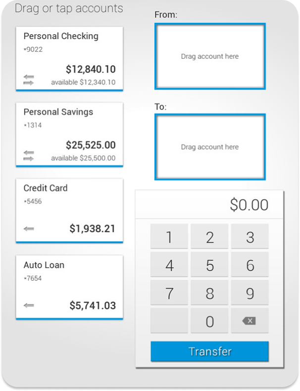
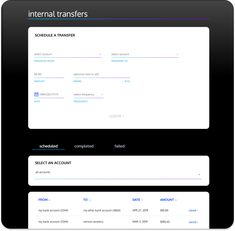
The original transfer experience asked customers to drag accounts into empty boxes and enter an amount on a calculator-style keypad. It supported only immediate, one-time transfers. The redesign organized the task around explicit decisions and added scheduled and recurring transfers, duration controls, memos, confirmation, and a place to manage transfer activity.
Built for the MVP: On iOS and Android, I used OS-native pickers, confirmation dialogs, and other components where possible. That reduced custom Engineering work while keeping important actions familiar on each platform.
The scheduling explanation puts processing information and the $10 transfer minimum at the decision point, before a customer confirms or encounters an error.
Canceling a scheduled transfer requires a second decision and states that the action cannot be undone.
Product decisions
Turning research needs into shipped features
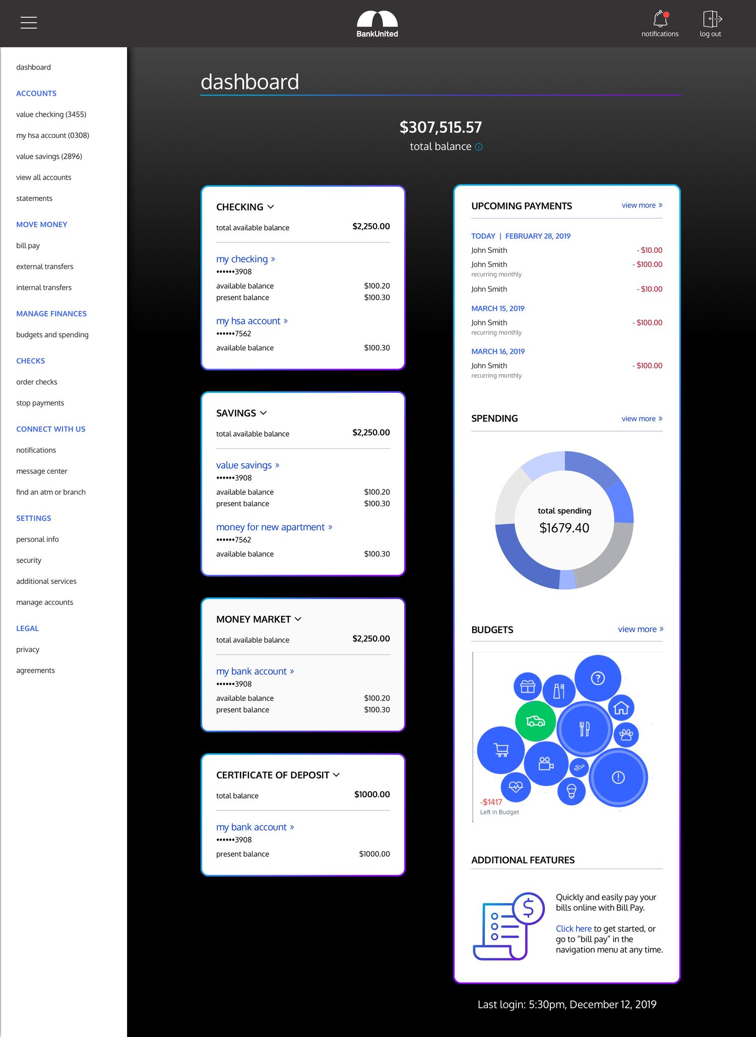
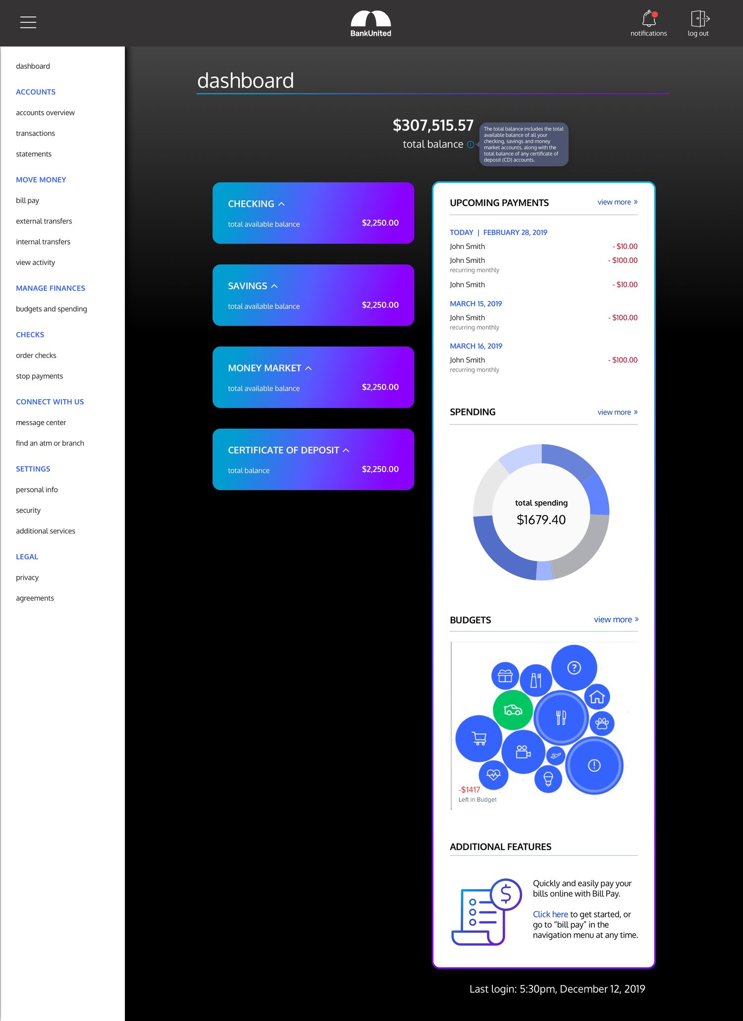
Mobile went fully dark. Desktop kept large white content panels. In 2018 our desktop users skewed traditional and expected online banking to look like the banking they already knew, so I kept that surface familiar. Mobile users skewed younger and more tech-forward, so that platform carried the new dark brand at full strength. This follows Jakob’s Law, the idea that people spend most of their time on other products and expect yours to work the way those already do. It was 2018, about a year before iOS and Android shipped system-level dark modes.
Keeping detail available without crowding the first view
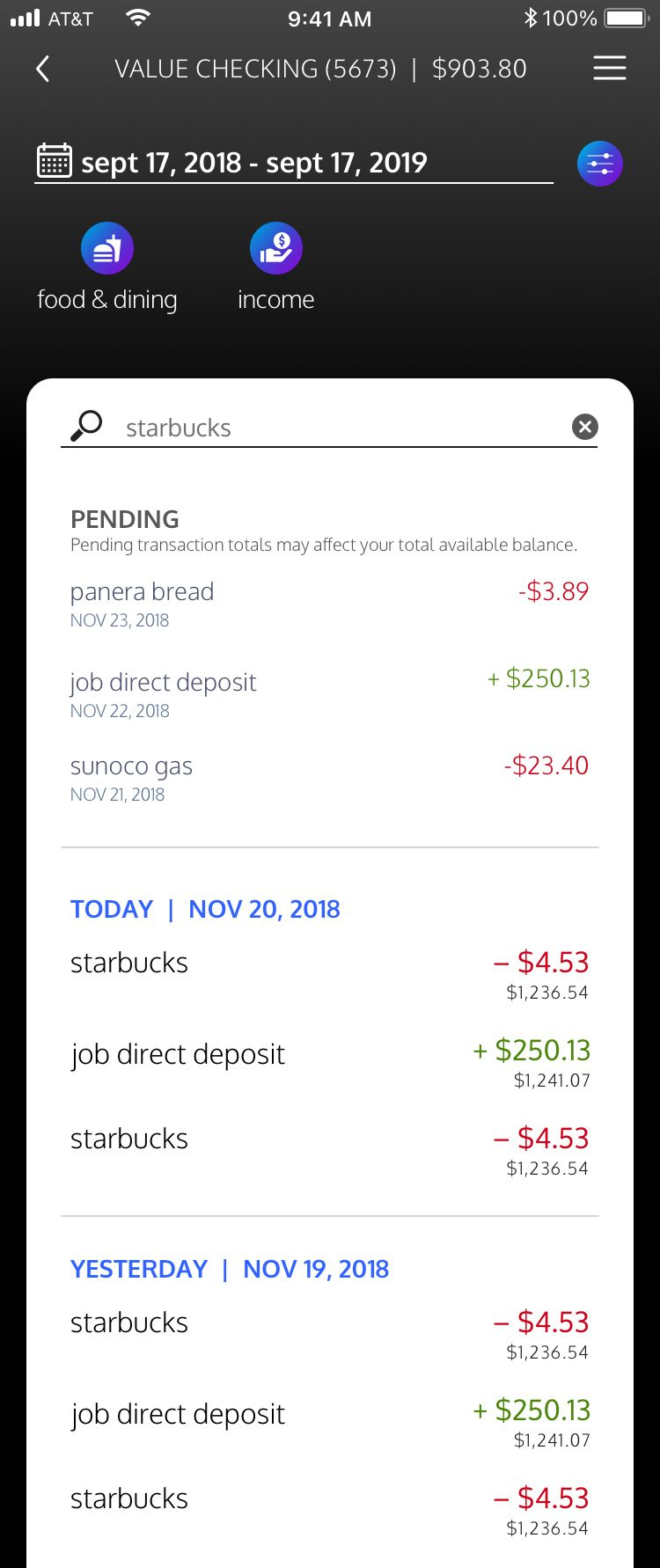
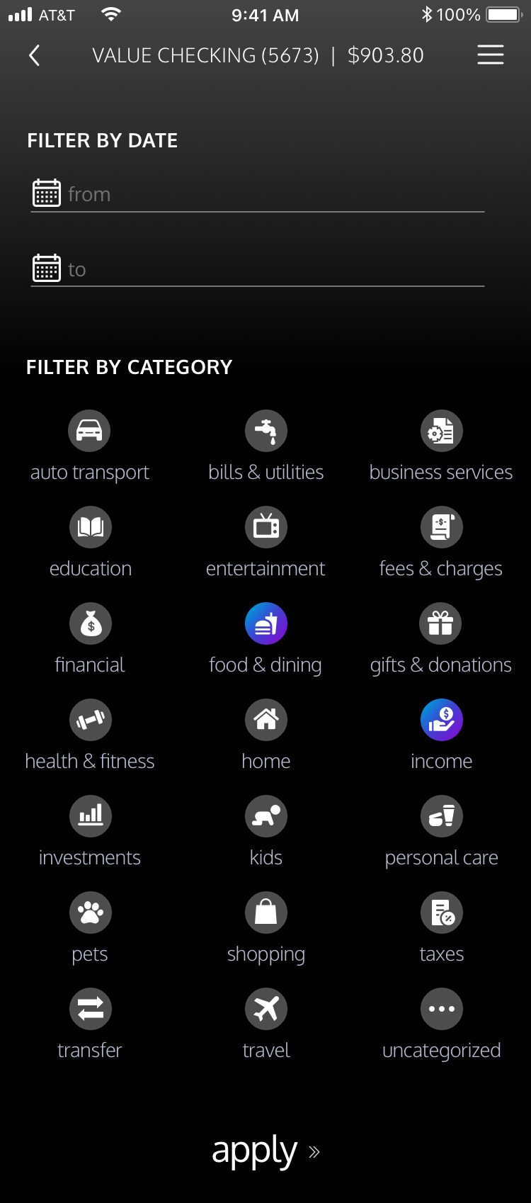
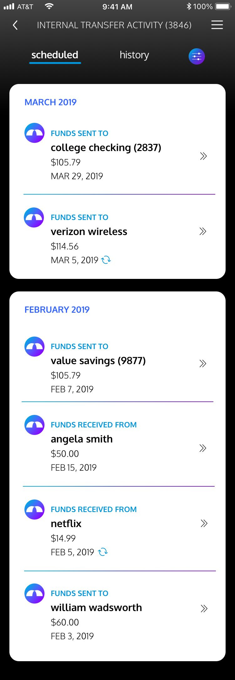
The detail moved one level down, not out of the product. Search, filters, and a running balance after every line live in transactions. Selected filter categories carry the brand gradient so the applied state is readable before you leave the screen. Transfers keep scheduled and history in one list, with a repeat marker so someone scanning can tell a one-off from a standing instruction without opening either.
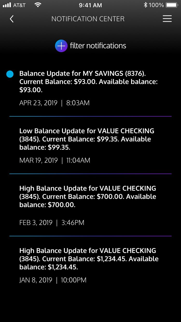
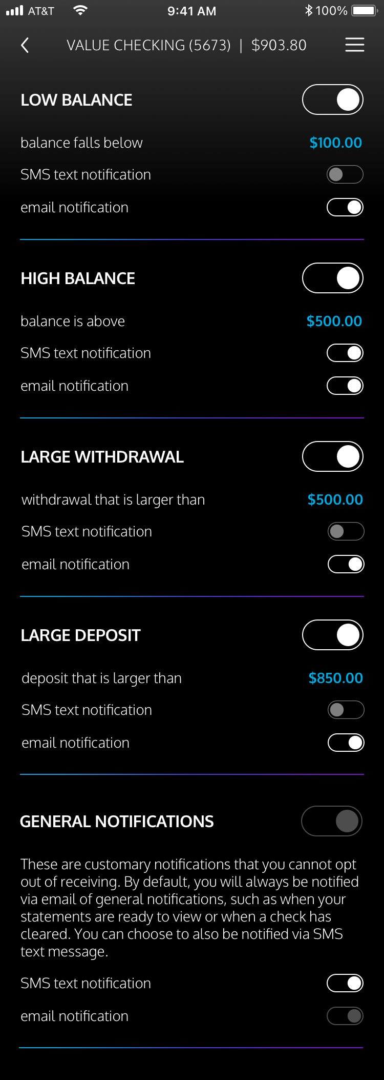
The Notification Center carried part of the research direction into the MVP. The real-time fraud response shown in the journey was deprioritized as business priorities shifted and did not ship while I was at BankUnited. Customers still gained more visibility into their money through configurable low-balance, high-balance, large-withdrawal, and large-deposit alerts. I advocated for three delivery options on every alert: an app push notification as the main toggle, with SMS text and email as secondary toggles underneath.
Giving customers a direct line to the bank
The Message Center introduced BankUnited’s first in-app messaging channel. Customers could raise questions or concerns, connect a message to an account, and continue the conversation in a thread. Submitted messages appeared on white panels for easier reading against the dark interface. The account picker reused the same grouped modules used in transfers and on the dashboard, so customers did not have to learn another selection pattern.
The count changes color after 500 characters and the send action becomes unavailable until the message is within the limit.
Discarding a draft requires confirmation and makes the irreversible result explicit.
System and delivery
Building the design practice and carrying the work through launch
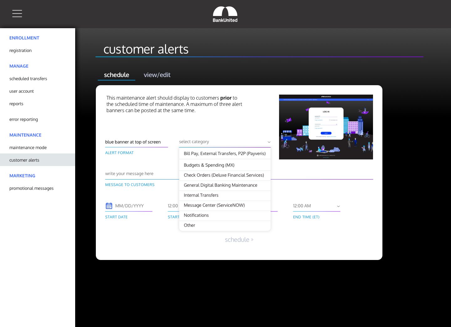
The bank had never had one. I built its first cross-platform, WCAG 2.1 AA compliant design system on top of Material Design and Human Interface Guidelines, helping Engineering move faster while keeping each platform familiar to its users. The system was designed to scale as the consumer product grew, then became the foundation for BankUnited’s small business banking products. For that next line of business, we evolved it into a stronger version 2 based on Google Material Design.
I also created the structure around delivery: prioritized stories, regular decision reviews, daily Engineering handoff, and a Legal and Compliance timeline that made the project’s critical path visible. I kept one product coherent across three platforms while requirements, compliance reviews, and implementation moved in parallel.
Partnering with Marketing to move customers into the new product
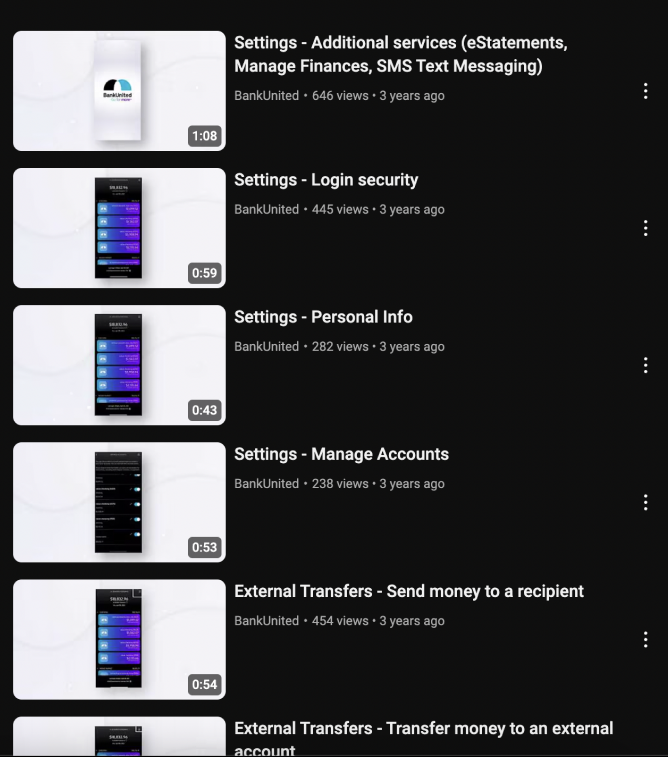
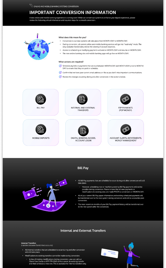
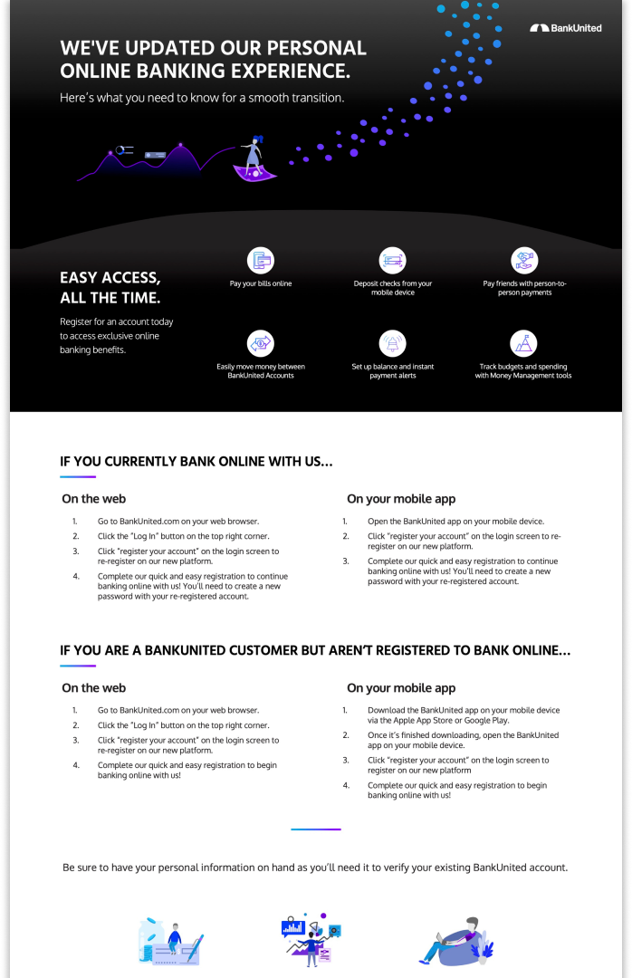
Partnering with Product and Marketing, I helped build the launch plan, wrote scripts, recorded voiceover for our app tutorials on BankUnited’s YouTube channel, and designed conversion and how-to pages that explained what was changing for customers.
I have seen Amanda transform a simple and poorly designed banking application into a thriving digital platform with an easy-to-use, sleek, modern, and user-focused design.
Outcome
The redesign shipped across iOS, Android, and web
Reflection
What I would do differently
The project shipped, but the retrospective is specific. I would improve the product craft, protect stronger research practices, and define success beyond delivery.
Push the UI system further
Redesign buttons and input fields to be more user-friendly, and push back more firmly when leadership decisions compromise their usability. I would also introduce more white space for a cleaner interface and create stronger consistency between web and mobile.
Test with more external customers
Continue the RFP I had started for a professional platform such as UserTesting, with budget for recurring recruitment rather than relying primarily on employee customers.
Advocate for design KPIs
We measured technical progress and defect resolution to protect the launch date. I should also have established quantitative experience measures so we could track whether the redesign improved customer outcomes.