Evergreen Wealth · September 2025 · Senior Product Designer
Joint Account Enrollment
Designing a mobile enrollment flow for two people, one account, and two passkeys.

Context
Evergreen Wealth
Evergreen Wealth is a registered investment adviser offering cash and investment accounts through custodial relationships.
I had previously designed Evergreen’s individual account enrollment flow. Joint enrollment was introduced as a follow-up feature, building on that foundation while introducing a more complex problem: two people need to open accounts together, but they do not complete every step in the same way or on the same device.
Challenge
A shared account with individual steps
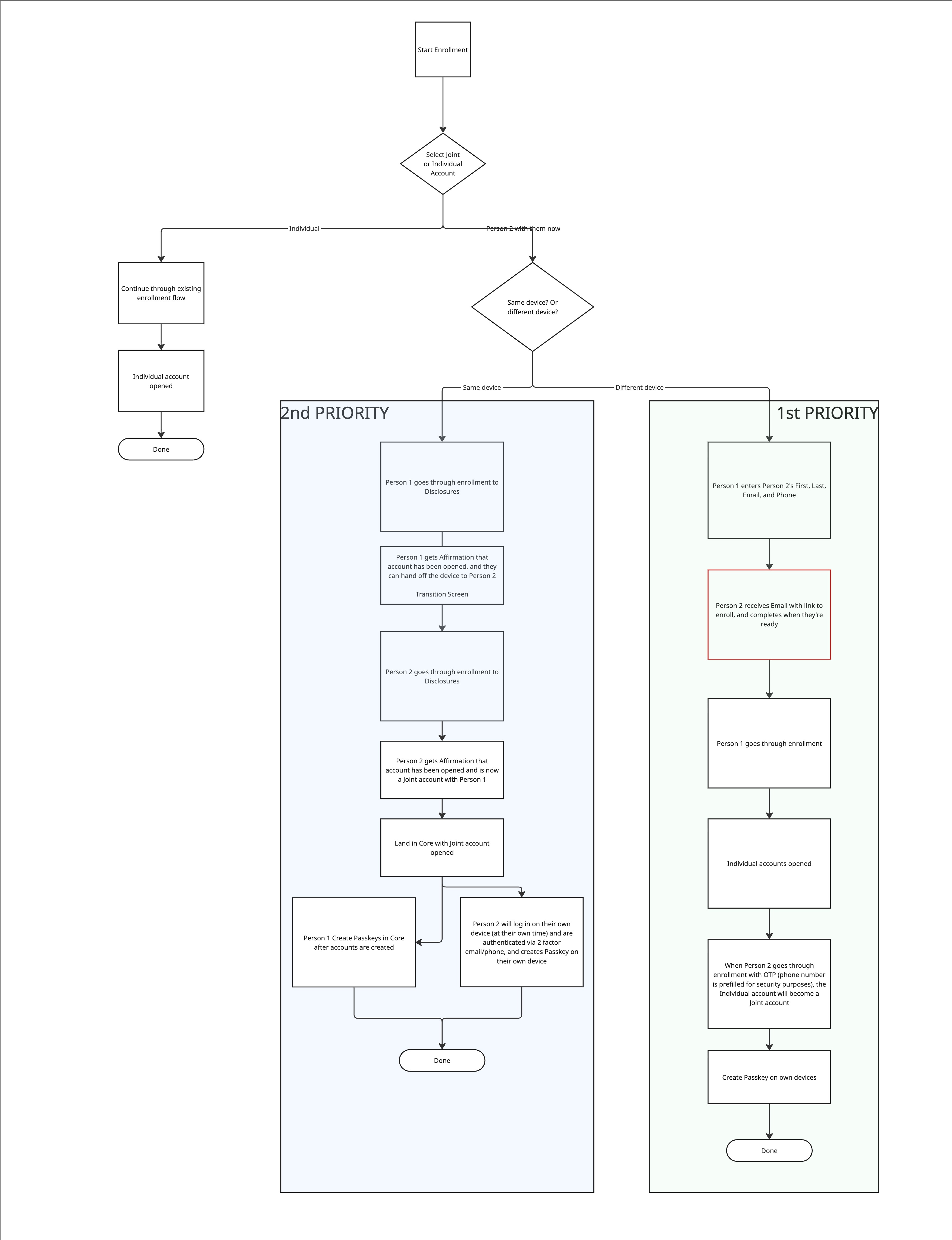
At the beginning of the project, the business considered two separate joint account enrollment flows: a same-device flow, where both account holders completed enrollment together, and a different-device flow, where the second account holder received an email invitation and enrolled separately.
The same-device flow supported enrolling together, but it could not support passkeys correctly. Evergreen used passkeys rather than passwords, and each person needed to create a passkey on their own device. The different-device flow supported personal-device passkeys, but split the enrollment experience between two people from the start.
Since Engineering had time to implement just one of these flows for launch, I advocated for a combined approach where clients began enrolling together while allowing each person to finish the steps that required their own device. Leadership aligned on this direction, and I designed the selected flow.
How might we help two people open a joint account together while preserving each person’s individual consent and device-based access?
Solution
One flow, two devices
The final experience begins with both account holders together on one device. They select account ownership, provide shared contact information, and complete their own enrollment information in sequence.
Once both people have completed KYC, the experience transitions to their individual devices. Each person receives a personal email link, re-authenticates, agrees to disclosures independently, and creates a passkey.
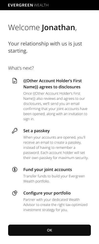
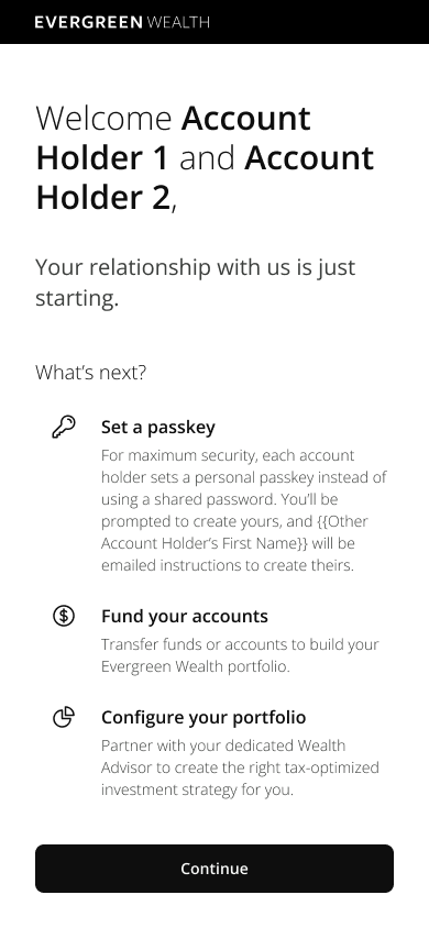
The welcome state reflects shared progress. It first tells one client what remains for the other account holder, then shifts to passkey setup and funding after both people complete their applications and disclosures.
My role
Senior Product Designer
I owned the joint account enrollment flow and managed design workflow and priorities with support from a contract designer.
I inherited Evergreen’s foundational visual direction. I owned the flow and introduced usability improvements across the experience, including progress indicators, progressive disclosure, additional explanatory copy, and selective iconography.
Bringing two flows together
One hybrid path
Advisor-supported shared decisions
Individual disclosures
Finish on separate devices
The final flow combined the useful parts of both approaches. The shared start kept the account holders together for the more complicated decisions. The personal finish made passkeys and individual disclosures possible.
Flow design
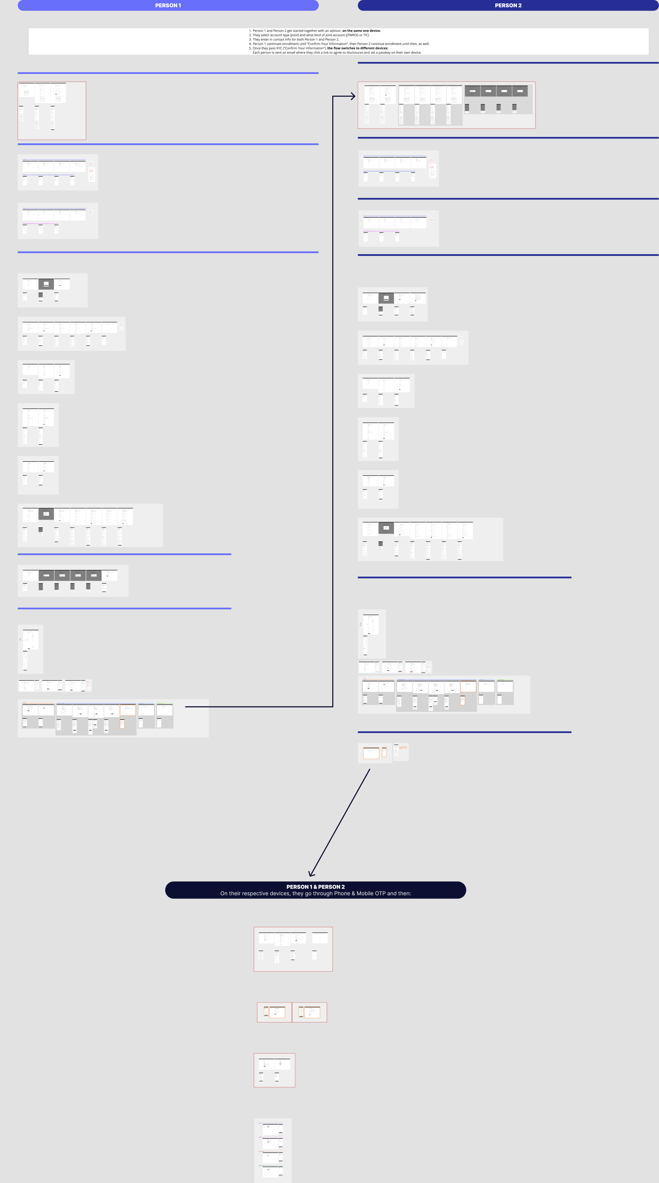
The full mobile journey
The Figma canvas documents the complete mobile experience, including shared-device steps, individual-device follow-up, and the screens that support each account holder’s required disclosures and passkey setup.
Design decisions
Orientation throughout enrollment
Enrollment requires each client to provide personal, financial, and regulatory information. I added a progress indicator so people could see where they were in the process and how much was left.
I used progressive disclosure so each screen focused on the information or decision immediately in front of the user. Clients could move between questions, review information in manageable sections, and go back when needed with the new back button. Nametag chips identified whose application the client was viewing.
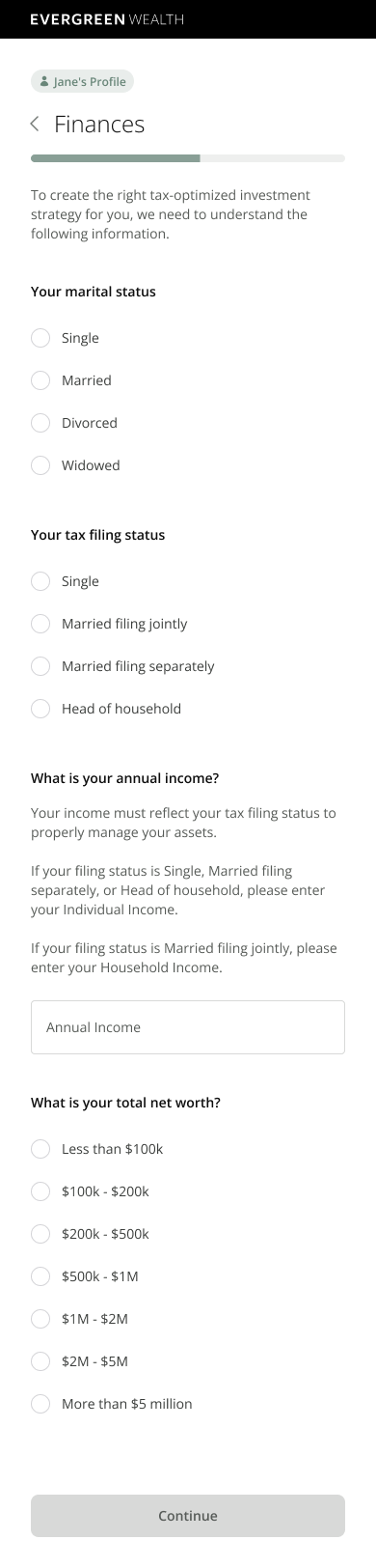
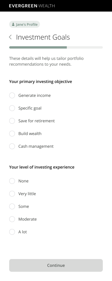
Each person always knows whose information they are completing. Nametag chips carry the account holder’s identity through financial and investment questions while progress indicators preserve orientation.
Explaining the ask
Financial enrollment can quickly feel invasive. I expanded the existing “why we’re asking” guidance throughout the flow so users understood why Evergreen needed specific information and what would happen next.
For joint enrollment specifically, the experience makes the relationship between the two account holders clear: both people have equal rights and responsibilities, while still providing and confirming their own information.
Making dense pages scannable
I advocated for using iconography selectively within lists and choices, especially where it helped distinguish options, orient users, and break up text-heavy content. Evergreen’s visual direction was intentionally conservative, so I made the case for using icons where they served a clear purpose.
Choosing an ownership structure
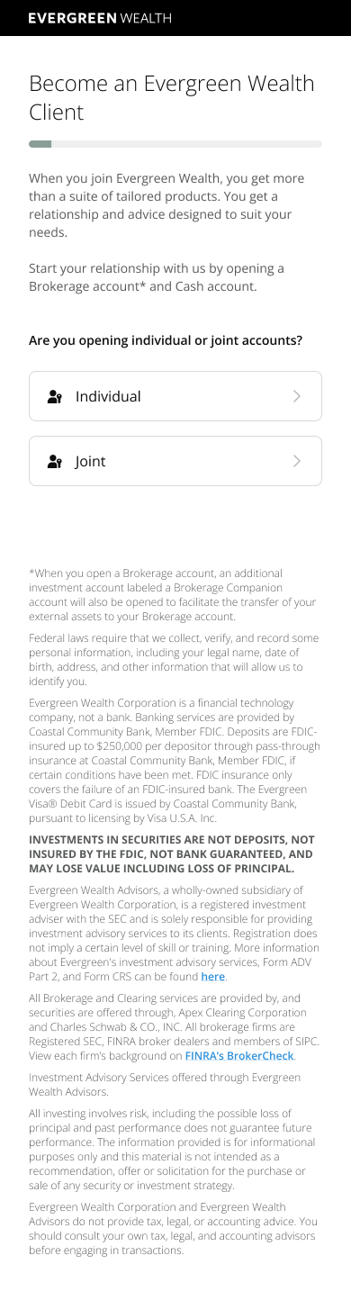
The product supports four joint account titles: Joint Tenants with Rights of Survivorship (JTWROS), Tenants in Common (TIC), Community Property, and Joint Tenants by the Entirety (JTBE).
I included a brief description for each option in a modal drawer, available when a client selects the info control. This gave clients information to discuss with their advisor while choosing an ownership structure.
Reviewing before KYC
Before KYC submission, each account holder can review their information in one place. I designed the review experience so users could update individual details through contextual edit drawers instead of restarting or navigating back through the entire enrollment flow.
Creating separate passkeys
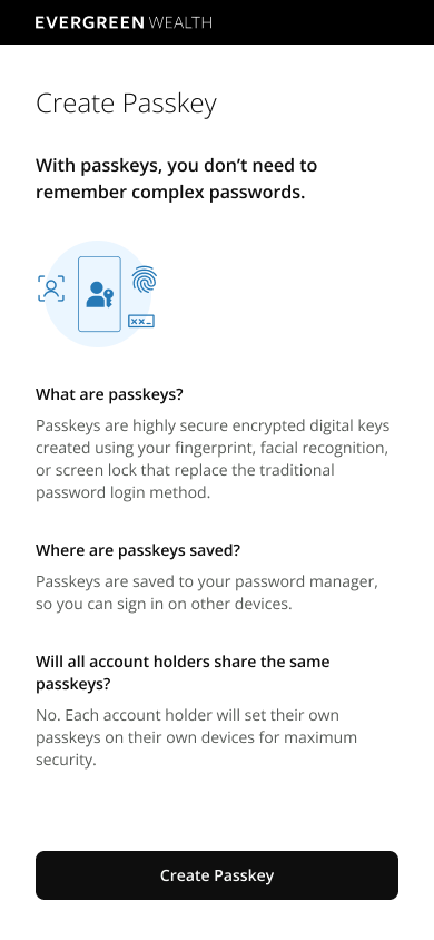
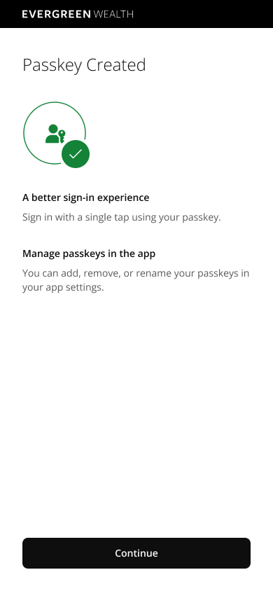
Each account holder creates a passkey on their own device. The experience explains the unfamiliar sign-in method before asking someone to act, then confirms what the passkey enables and where it can be managed.
What came next
Saving progress
I also advocated for users to save their progress and return to where they left off. Because this required more backend reconfiguration and the launch timeline was limited, this work moved to the backlog for a future release.
Outcome
Launched September 2025
The sales team used the experience while helping clients enroll. Feedback was positive: the flow was described as clear, easy to understand, and less overwhelming than clients expected from a detailed financial account opening process.