Evergreen.ai · Miami · 2025–present · Senior Product Designer
Owning design at a wealth startup, and moving it into the codebase.
End-to-end design across the product, its first AI experience, and the pipeline that gets design into engineering.
Context
The product kept changing shape.
Evergreen began as a traditional wealth manager, with its own cash and investment accounts as a registered investment advisor. The team then added an LLM for financial advice and the ability to link outside accounts. Now the product is moving toward an LLM-first experience for financial advice and wealth management, with linked accounts at the center.
I have designed through each stage of that evolution: organizing the design system, building the generative UI components, and creating the themes and app shell that make a changing product feel coherent.
I explored and advocated for directions that did not all become the final product. The direction that shipped reflected organizational priorities at the time. My role was to carry the strongest ideas forward, adapt the system as the strategy evolved, and keep the experience coherent for customers.
Designing for screens that do not exist until the model builds them.
A generative UI app cannot rely on a fixed set of screens. I structured Hemlock across two connected layers: the app shell, including navigation, chat, and static settings pages, and the components the model can assemble inside a detailed answer.
I documented those component rules in code and Markdown so generated responses use the same formatting, numerical conventions, data visualizations, and financial tools. The data-visualization specification covers chart types, axes, gridlines, tooltips, legends, comparisons, and responsive behavior across the light and Midnight themes. I also selected Lucide as the shared icon set to give the interface consistent symbols that Engineering could implement without creating a separate custom library.
Visual language
Carrying a familiar foundation into an AI-first product.
In Summer 2025, I led the Evergreen Wealth app rebrand. I established a light taupe palette, with black and white retained from the legacy brand, to make complex financial information feel less intimidating. The quieter background put the focus on the content that mattered most: account data, visualizations, and calculation tools.
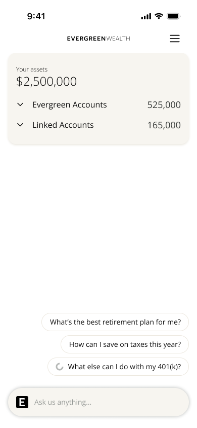
1. Accounts and suggested questions. A new home screen combining the Accounts module with Evergreen Intelligence chat.
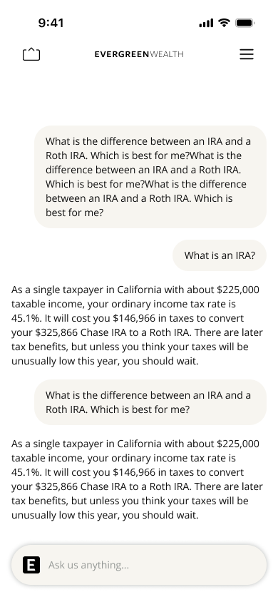
2. Chat opened directly. Evergreen Intelligence takes over the home screen when someone starts a conversation.
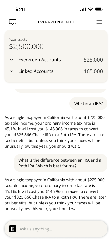
3. Chat with Accounts visible. The control at the top left shows or hides the Accounts module without leaving the conversation.
Type chosen for financial data and long-form AI answers.
In Spring 2026, as the organization shifted to Evergreen.ai and began building an LLM-first product, I used Pen.dev to explore and develop new layouts and the product experience. The earlier palette provided continuity. I added a typography system designed for financial data and long-form AI guidance.
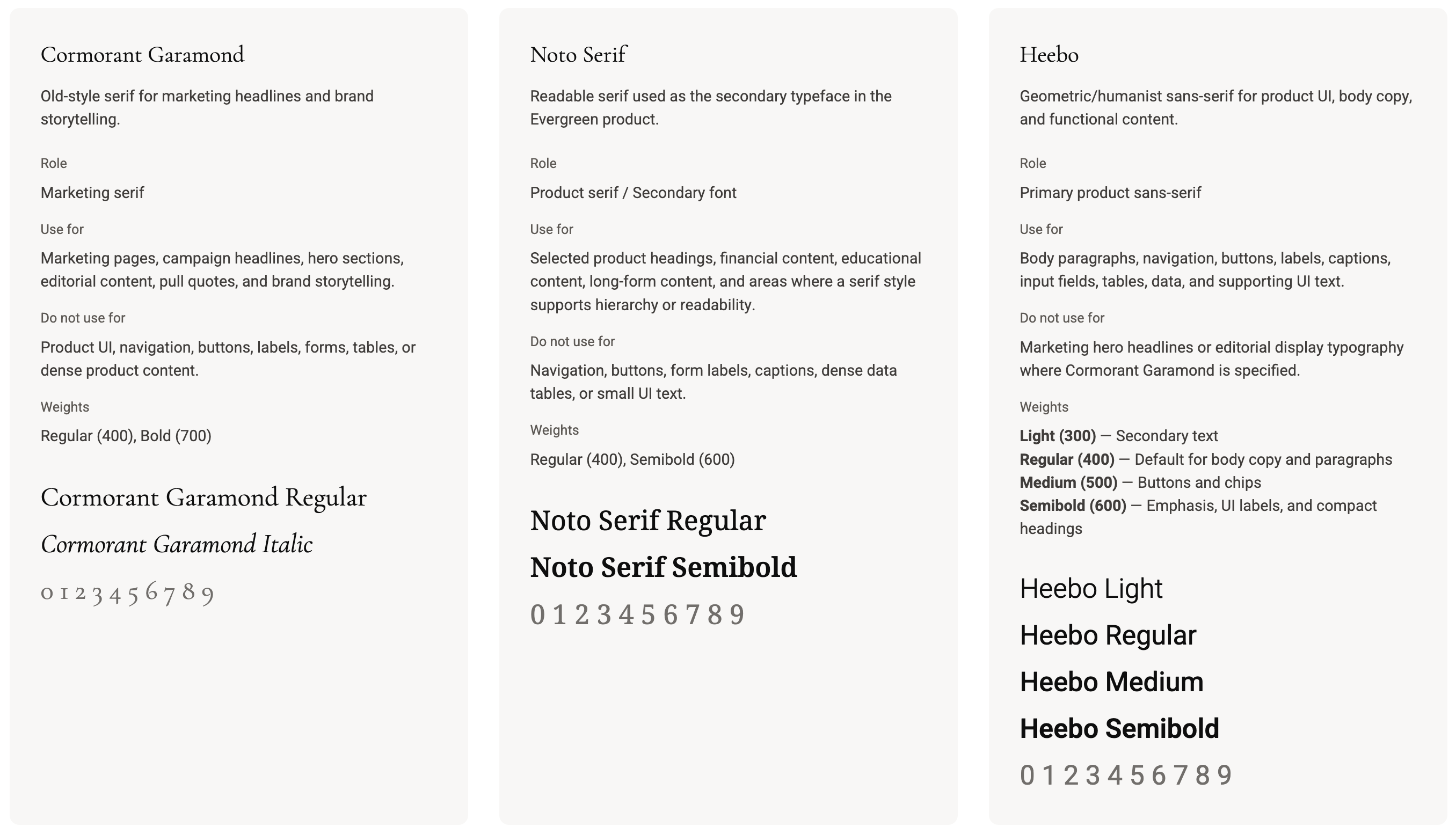
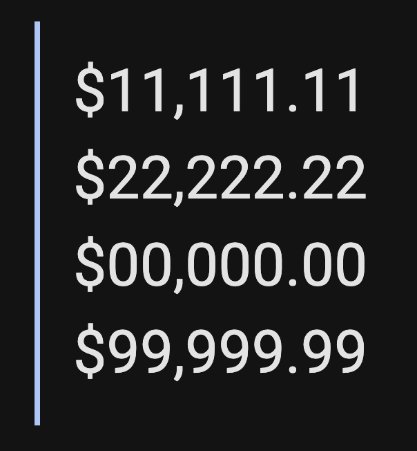
For body copy, I selected Heebo, a sans serif grotesk, for legibility in detailed, LLM-generated responses. Its tabular numerals keep dollar amounts aligned in tables, financial summaries, and accounting-style totals. A narrow 1 takes up the same width as a heavier 9, and the unslashed zero fit the product’s minimal visual language.
For display typography, I used the more traditional Cormorant Garamond in creative exploration for some time. It was difficult to read at the sizes used in product UI, as opposed to larger marketing creative, and its unevenly proportioned numerals distorted important financial figures. I selected Noto Serif instead: it retains an editorial quality while providing clearer, more evenly proportioned number characters for a financial product.
Thirty chart colors that keep a dense screen calm.
Financial products reach for the same blues and greens. I wanted the data to feel calm, but it still needed to stand out against a sea of text in both light and dark mode. I used pastels with slightly more brightness than a traditional pastel palette, organized across six hue families from light to deep. A chart with two series and a chart with twenty stay in the same range. Every color carries a token name and a value in both themes, so a chart drawn in light mode redraws in dark without anyone picking new colors.
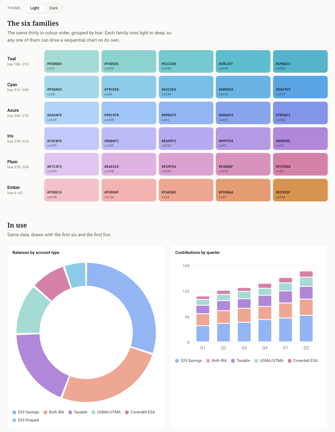
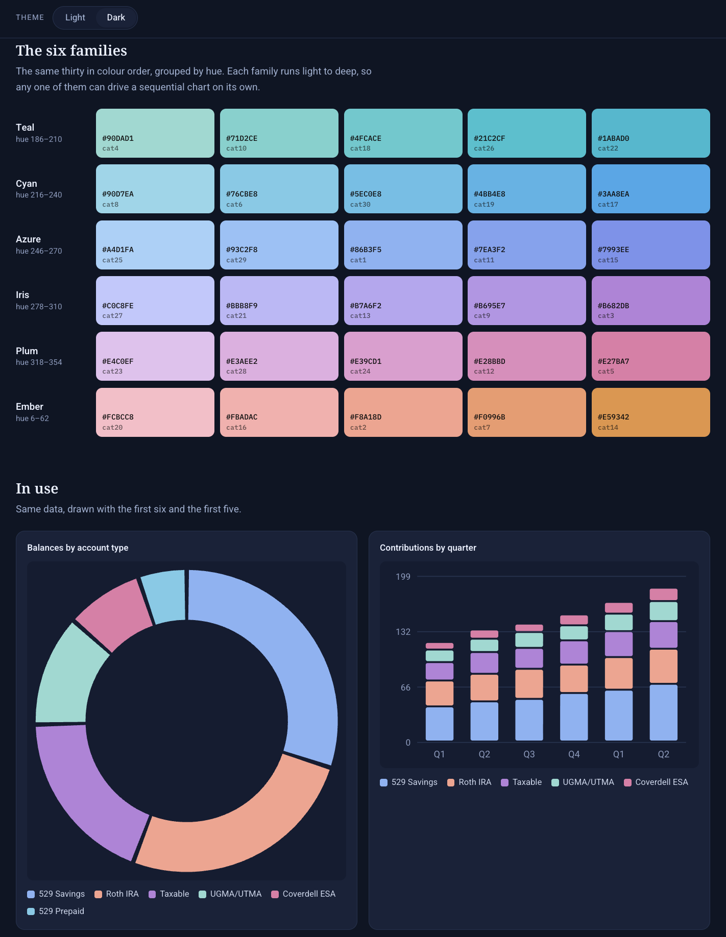
The categorical palette in both themes. Six families, thirty colors, ordered so the first few read clearly together. The charts underneath draw the same data with the first six and the first five.
Making dark mode feel like Evergreen.
I used Claude Design to develop the Midnight theme and create working artifacts that translated into the product experience. I chose navy because it felt more distinctive than the black and dark gray palettes common across other products while remaining neutral and appropriate for our clientele. The navy supported legibility and gave the categorical chart colors more presence. A subtle gradient in the chat panel added depth and separated the conversation from the working View area.
Key design decisions
Keeping conversation and detailed financial work connected.
Keeping chat primary on mobile.
On smaller screens, chat and detailed answers remain inline because there is not enough room to keep the conversation and a separate View visible side by side.
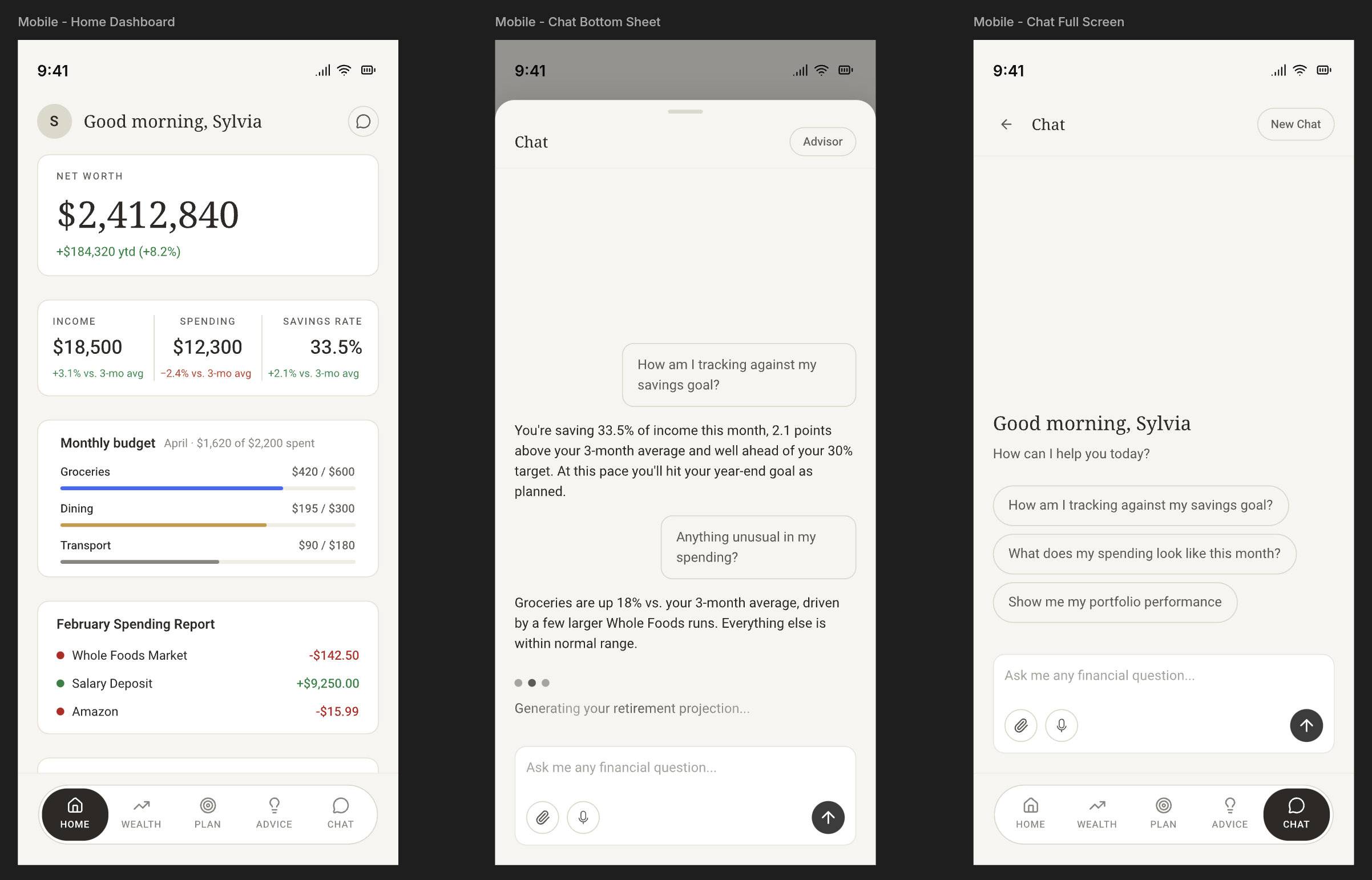
Bottom navigation was a difficult convention to cut because it is familiar and easy to use on mobile. It ultimately took too much room at the bottom of the screen, where the chat input needed to live. We prioritized keeping the input immediately available so chat could remain the focus of the experience.
Giving the View room to work.
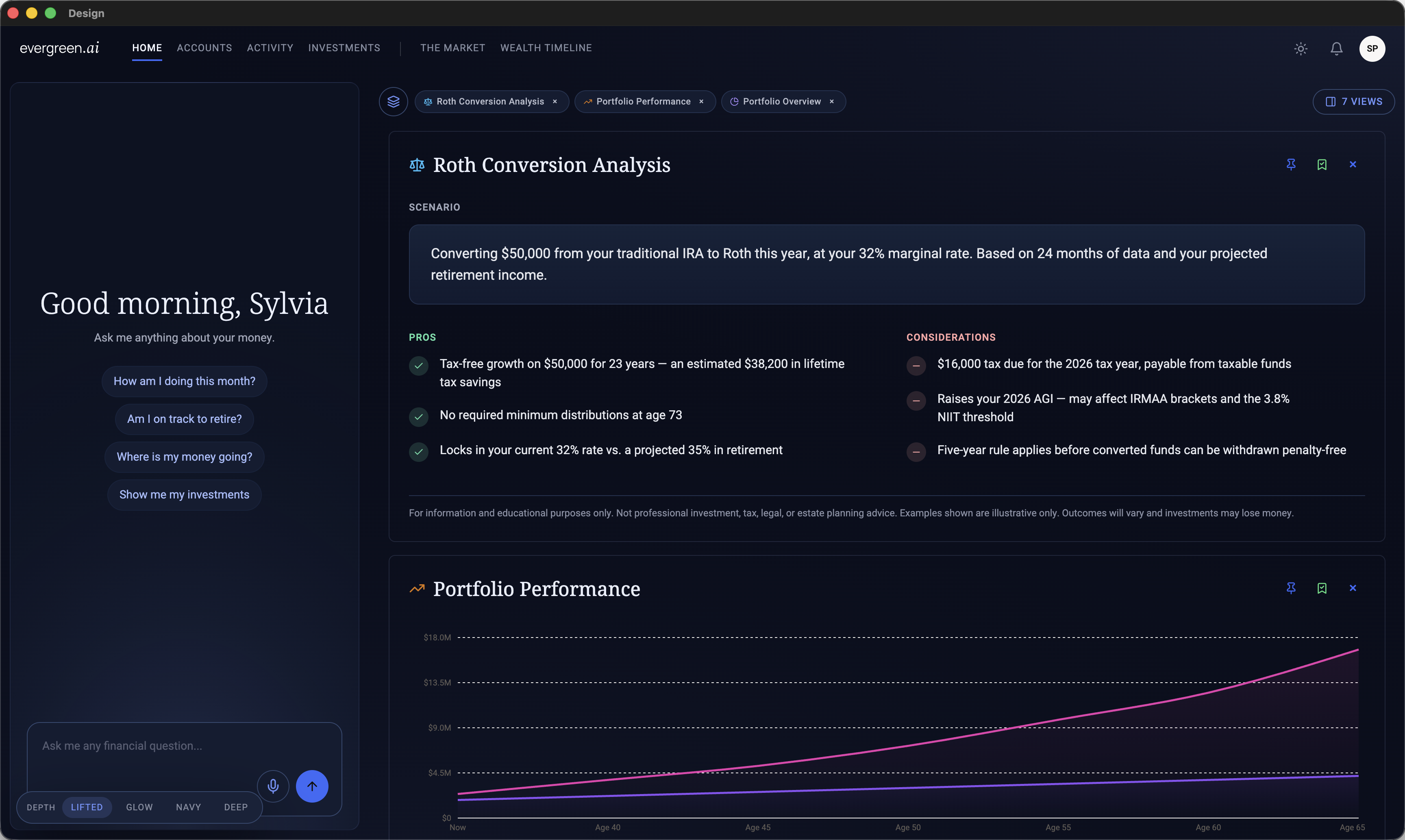
The View is the workspace where a detailed response generated from chat appears. The chat panel can show a quick answer when that is enough, or a short summary when the full response needs more room. The View holds the full answer, including data visualizations and financial calculators that explain the topic or provide more insight. It can also display PFM screens selected from the top navigation.
On desktop there is room to separate the two. Leadership wanted more screen real estate for that detailed financial output. I recommended a desktop layout that kept chat anchored on the left while giving most of the canvas to the View on the right. Tabs allowed people to move among generated answers and PFM screens without losing the conversation that produced them. The Views menu provided access to previous chats and a place to save useful views.
I used Claude Design to explore the layout and create working artifacts that informed the product experience.
Keeping the floating buttons consistent with what we already had.
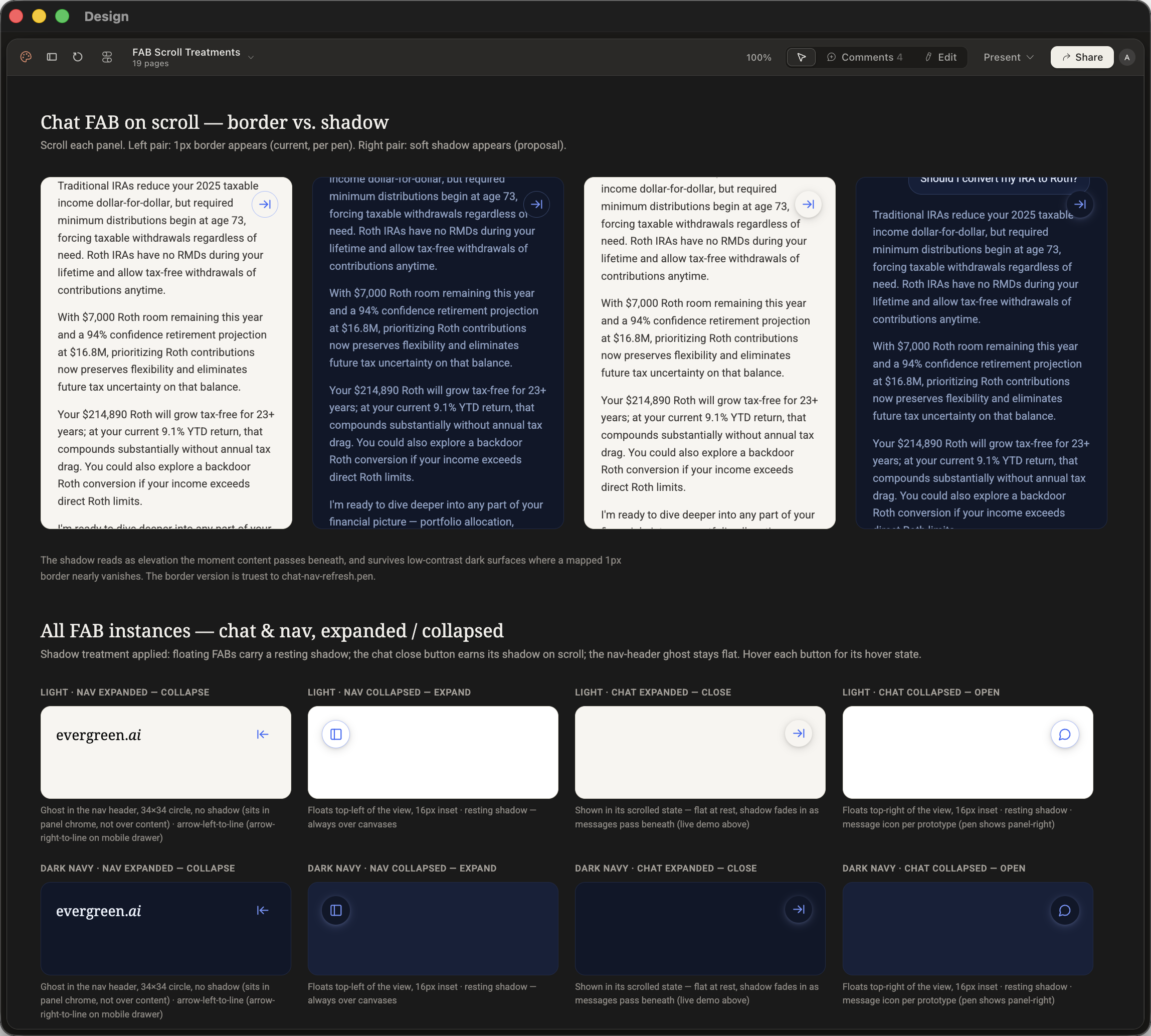
Chat and navigation both collapse into floating buttons so people can reach the rest of the app without losing the conversation. I explored two treatments in Claude Design. A 1px border appears as content scrolls beneath the button, which is what chat-nav-refresh.pen already specified. A soft shadow appears instead, reading as elevation the moment content passes underneath and holding up on the dark navy surfaces where a mapped 1px border nearly vanishes.
I preferred the shadow. Shipping it would have meant redesigning every other button to match, and Engineering did not have that time before launch. The border shipped because it keeps the app consistent with the design language already in place. The shadow exploration is documented for when there is room to do it properly.
Choosing the chat interaction that could ship first.
I initially explored a broader set of mobile chat features: voice dictation, attachments, new conversations, and chat history. The team chose to sequence attachments, new conversations, and chat history for later releases, so voice dictation became the launch feature.
I designed the input across its empty, typing, recording, and transcribing states. During recording, an animated waveform confirms that the microphone is active. The transcribing state quiets the controls and makes the system’s progress visible.

The working prototype brought several motion decisions together: suggestion chips cycle and move a selected prompt into the input, the voice waveform responds during recording, and thinking mode shows that the system is working before the response appears. I delivered it to Engineering to make the timing and transitions concrete.
Making suggested questions available without becoming distracting.
I built a working prototype for the suggestion chip motion and delivered it to Engineering as the interaction reference for launch. Each prompt slides up and out as the next enters from below, creating a quiet rotation of possible starting points without moving the rest of the screen.
The transition runs for 300ms with an ease-out curve. It pauses on hover or focus, respects reduced-motion settings, and clicking a prompt places that question into the chat input. Engineering implemented the interaction for launch.
Designing the wait so it does not feel like nothing is happening.
A generated answer takes time to arrive and its length varies with the question. The skeleton keeps something on screen through that wait so people know the app is working and an answer is coming, rather than sitting in front of a blank panel wondering whether they should ask again.
It also blocks out the shape of what is arriving, so a table does not land where prose was expected and the answer arrives without a jolt. A determinate progress bar would have to promise a finish time the model cannot guarantee. Each theme has its own skeleton so the wait never flashes bright on Midnight.
AI-first Workflow
Moving design into the codebase.
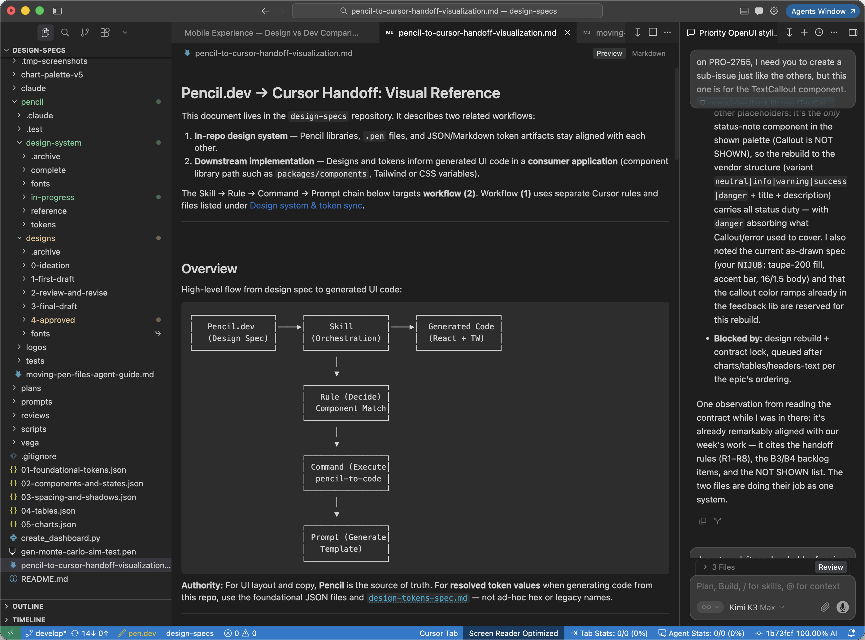
As the Engineering team transitioned to using Cursor IDE full-time, I experienced firsthand how much faster product development could move. After using it to help design and ship a company website in two weeks alongside a front-end engineer, I began looking for a design tool that could support the same kind of workflow.
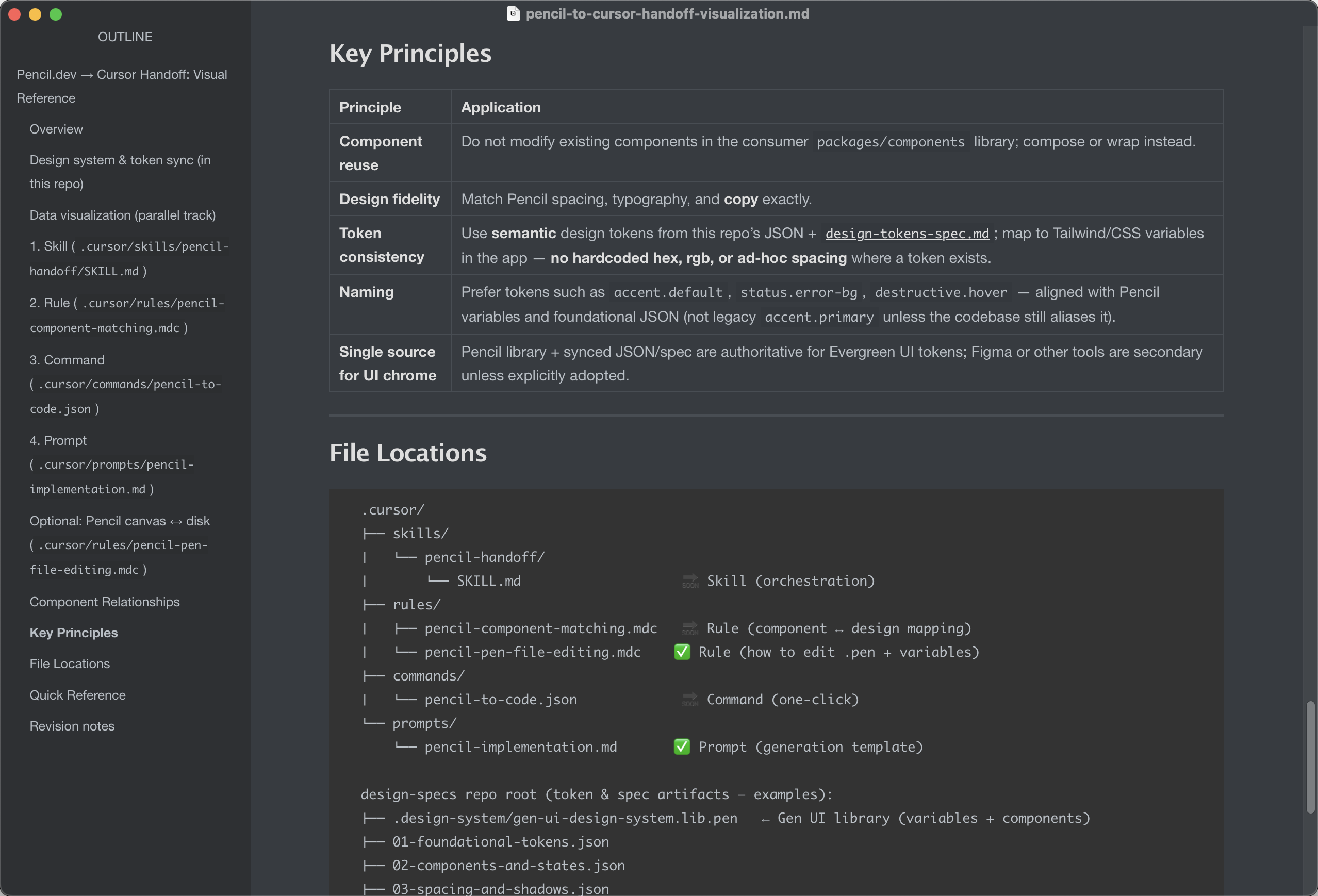
After reviewing several options, Pen.dev, formerly Pencil.dev, was the clear choice for its balance of multi-agent AI generation and precise deterministic design control. Its Cursor MCP extension and CLI allow Product, Engineering, and Marketing to access the designs and the supporting files from the same repository. I created that repository to hold the product’s design source of truth and the instructions that keep the work moving.
Cursor’s Linear MCP integration means I write engineering tickets from the same IDE the design lives in. I give the agent the Pen.dev file and the live URL in Cursor’s browser and it runs a design QA against both, returning an HTML handoff file: token-level corrections that keep the design system consistent, and UI defects that bring the build back to the intended design. It speeds the pass up rather than doing it for me, so I still check the small details myself. The ticket, the design, and the code stay in one place.
Artifacts include:
Source of truth
What the product is built from
- Hemlock components and tokens
- Pen.dev design files
- Generative UI specifications in HTML and Markdown
- Working prototypes
- Fonts, images, and logos
How the work runs
What the team and its agents follow
- Agent skills and repository rules
- Design direction and workflow files
- AI-generated, human-reviewed design audits
- Process and handoff documentation
- Implementation tickets and QA findings
Tools used: Cursor IDE, Pen.dev, Claude Cowork, Claude Design, and Claude Code
Models favored: Kimi K3 Max for design-heavy work, Fable 5 for complex systems work, Opus 5 for straightforward tasks, and GPT-5.6 models for editorial needs.
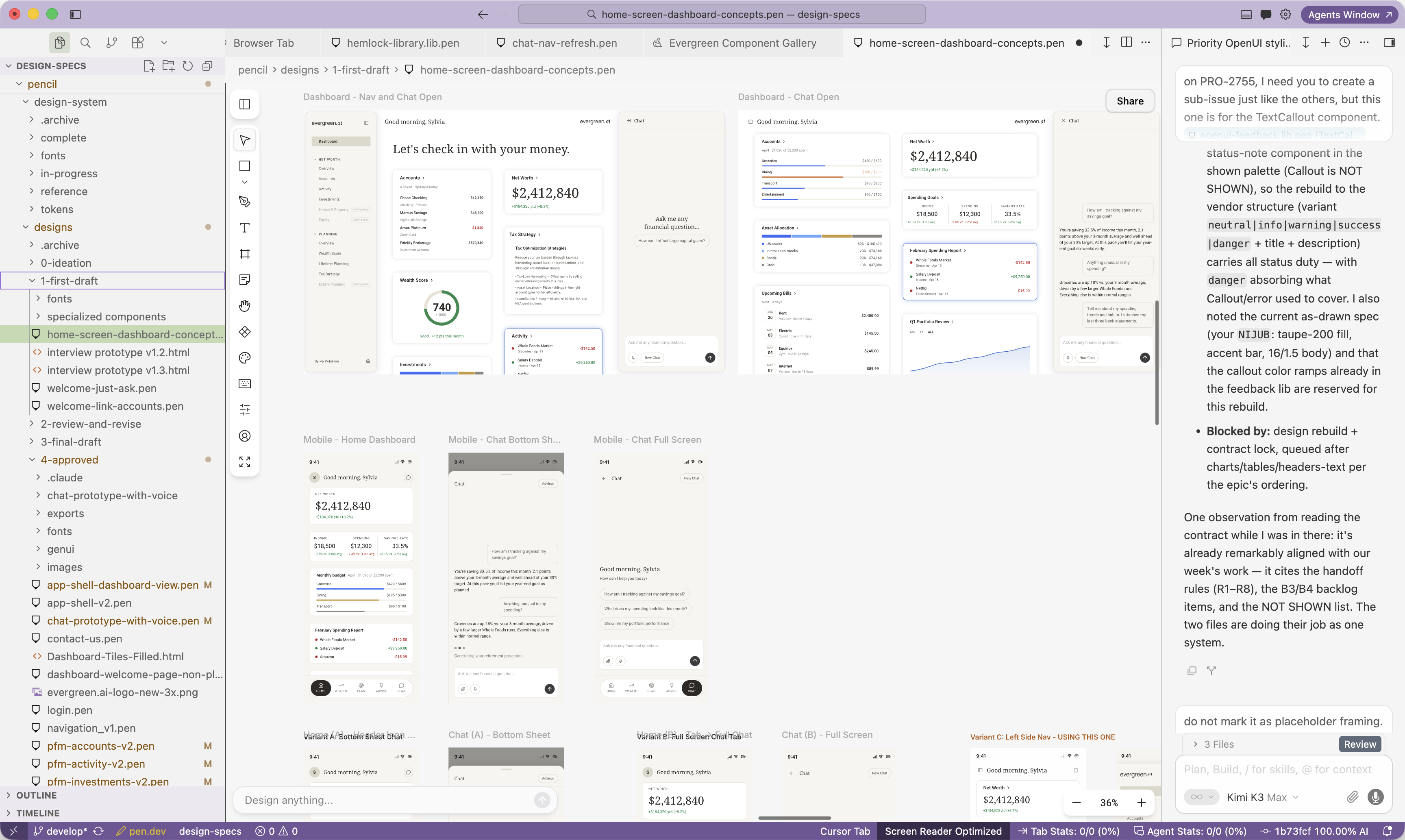
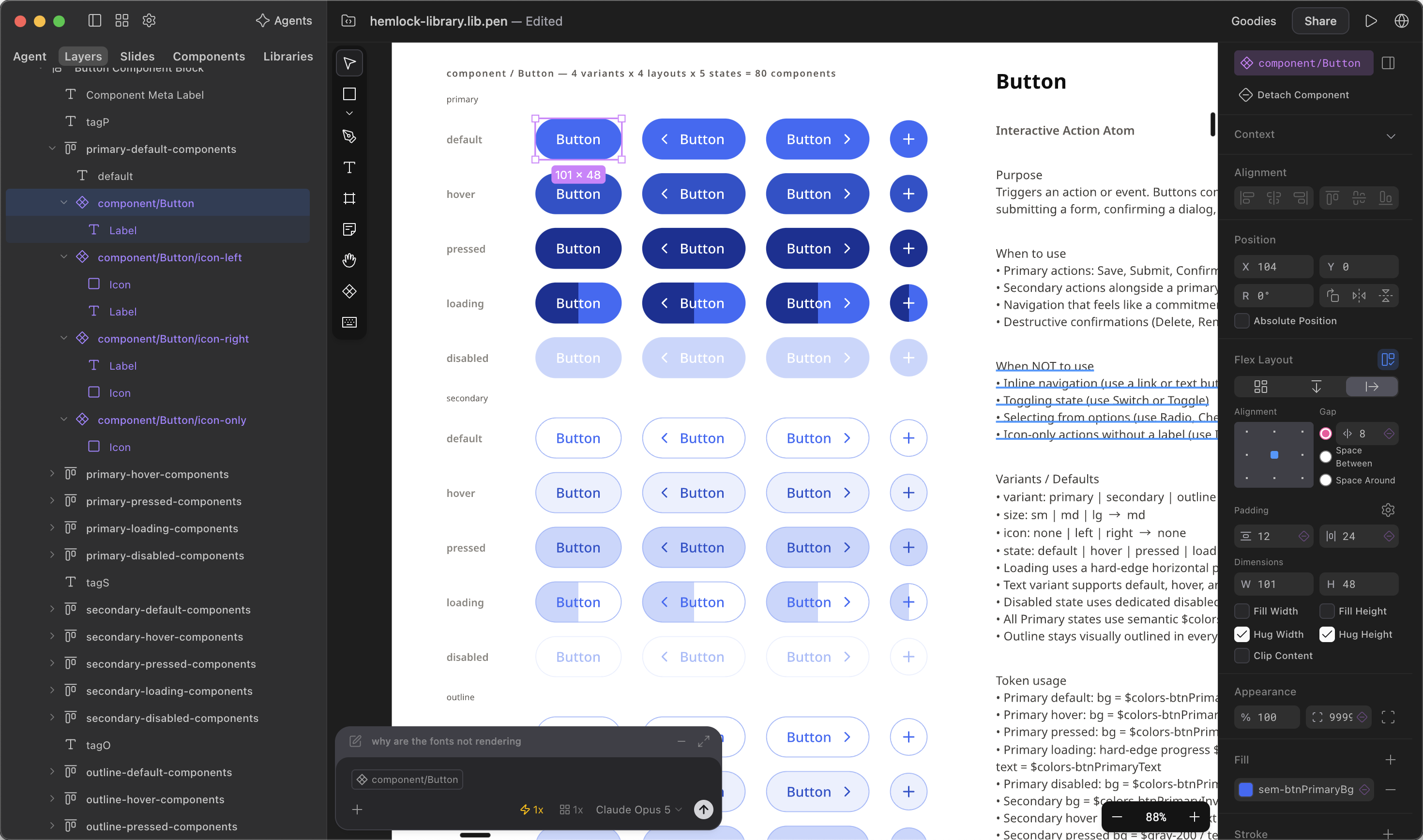
I rebuilt the design pipeline before designing the AI product. That sequence helped the team ship at the pace the business needed.
Reflection
What I would do differently
I would bring more customer research into the work before launch, then keep learning once it was live. I advocated for it at the time because the move from account-based wealth management to an AI-first experience changed what we were asking people to trust. More customer conversations and usability sessions up front, plus launching in-chat like/dislike and feedback from day one, would have helped us test the product structure and language before decisions hardened.
I would also push the app layout further, making better use of the available space and improving usability, and include chat history at launch. I designed the navigation to leave room for both, but the launch scope followed a different sequence. Chat history is an important part of an AI product: it gives people continuity across conversations and a way to return to work they found valuable. My priority is to give people what they find most valuable in a way they can quickly understand and use.